Sev Seveer – Smithereens
| Label: | Beats of All-Nations – BOAN-004 |
|---|---|
| Format: | Vinyl, LP, Album, EP, Limited Edition, Stereo |
| Country: | US |
| Released: | |
| Genre: | Hip Hop |
| Style: | Instrumental, Boom Bap, Jazzy Hip-Hop, Trip Hop |
Tracklist
| A1 | Don't Point! | 2:10 | |
| A2 | Circus Sideshow | 2:12 | |
| A3 | Televised Chocolate | 2:59 | |
| A4 | Seuratcha Sauce | 1:44 | |
| A5 | CSG x CSG (megiapa x sev) | 2:01 | |
| B1 | Smithereens | 1:26 | |
| B2 | CirkusWerkus | 2:09 | |
| Bonus Tracks | |||
| B3 | Track 01 | ||
| B4 | essOess (June in Space) | ||
| B5 | OGCSG |
Credits
- Art Direction – RTST
- Artwork – Ras Om
- Artwork By – Fonte
- Engineer – Porchlite
- Executive Producer – Beats of All-Nations
- Lacquer Cut By [Uncredited] – Richard Houghten
- Mastered By – Tenacity
Notes
Only 300 Pressed. Includes 4x6 portrait postcard with liner notes by Sev Seveer and 3 vinyl-only bonus tracks not available on digital release.
Liner Notes from Sev Seveer:
Smithereens is yet another one of my journeys into bringing visual stimuli to sonic fruition. In this case, my prompt and inspiration was Neo-Impressionism, particularly Pointillism. Last year I created an instrumental that eventually became the title track of this project. The song was so complex in nature; I couldn’t even tell you where my mind was when I was arranging it. It wasn’t a recording that I was sure I liked at first, mostly because of its frantic and composited structure. In an unrelated instance (or maybe it was related, subconsciously) I was reading about Georges Seurat and his role in leading the French Neo-Impressionist movement in the late 1800s. It occurred to me that this style of visual art was the only way I could describe the song that would eventually go on to establish Smithereens as a project. Initially, when I began to lay out supporting instrumentals, I made stringent attempts to abide by the complexity of the concept song. I found that it couldn’t be done, and that the beat was truly a moment in time. I then decided to continue studying Pointillism/Divisionism and some of its key characteristics— the progressive yet realistic use of primary colors, lighting, contrast and also very importantly, movement— as my guide in arranging new instrumentals in their own unique way, while still keeping with the prompt.
In music theory, the parallel/counterpart to Pointillism is known as Punctualism. Punctualism essentially gives unique individual life to each note in a piece. Arpeggiated notes of varying pitches, lengths and dynamics take the place of the ‘colored dots’ that you see in pieces such as Seurat’s most famous work, “A Sunday Afternoon on the Island of La Grande Jatte.” The techniques were independently established of course, i.e neither gave birth to the other. Their juxtaposition is largely interpreted perspective.
Aside from accomplishing the unity of visual and sonic cues, an important goal for Smithereens is to define new, deliberate ways to use the Roland/Boss SP machines. I used The SP-202, SP-303 and SP- 404 for the project; all of the songs were recorded with a motif style that involved long, live layering takes of my hitting a note loaded onto a pad repeatedly while riding the pitch effect at various parameters. Sometimes I would use the first note of a longer loaded sample to “tease” the sample in and out of the beat, as you hear on “Televised Chocolate”. This was solely inspired by my research into punctualism. In addition to the pitch effect, I used the time stretch function often for its distorting effects and also the unique pitch parameter in the DJ-effect-looper, all to provide a texture that sounds like a bubbly, gurgling composited arrangement of independent tones. Some songs, such as “CSG x CSG”, take a literal approach to individual tones. Others, such as “Seuratcha Sauce” utilize a treatment that is more textural in nature, yet still composited and thus still in the spirit of punctualism/pointillism were you to close your eyes and visualize. Other pieces offer both approaches.
When I realized this was a sonic-visual project, it was a no-brainer that the cover artwork had to go hard, and that it had to be representative. I was fortunate enough to work with several artists for this project. When discussing the visual possibilities, I received incredible insight from Anna Szymczak, a creative savant who I am fortunate to also call my partner. In addition to her work as an accomplished civil rights attorney she is an equally talented painter and sculptor. She is well-studied in surrealism, and upon hearing Smithereens she suggested that I also look into the work of Russian abstract expressionist Wassily Kandinski. Kandinksi was a multifaceted artist whose works and styles span many phases, including but certainly not limited to pointillist techniques. He was a pianist and proponent of the unity of sound and color, often assigning tonal and chordal identities to the latter. Kandinski’s pieces were more abstract than the Neo-Impressionist styles that I had been exploring, but I found his work to be unequivocally inspiring, particularly the pieces created during his time teaching at the Bauhaus school in the mid-1920s. These works were highly geometrical and design-oriented in style, and, useful visual examples of Gestalt psychology— a theoretical framework dealing with the brain’s ability to perceive things as whole, rather than as individual parts. Kandinsky’s Bauhaus works were characterized by shapes, lines and strategically-placed colors, appearing initially to be chaotic, but actually quite unified. I found so much similarity to what I was doing with Smithereens in Kandinsky’s paintings, and in reviewing his work I felt a feeling of closure.
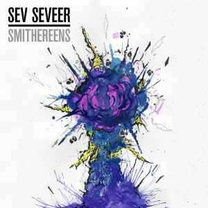
RasOm, who created the artwork for my last project, Constant Elevation: Odessa Star, took the reins on one of the potential two variations of Smithereens covers. His work in digital pixel sorting is very similar in nature to the lighting techniques seen in Pointillist arrangements. He was able to "chop and screw" a great photo of a leaf print on a random sign in Northwest Chicago, taken by Mike Bump, and transform it into a piece that fit the original concept perfectly. Ras Om's interpretation made the A-Side label. Our other artist, Fonte, is a longtime friend of mine, DJ, beatmaker and painter whose works often reflect the sentiments of a roof-dwelling graffiti writer born and raised in Chicago. His “Smithereens” piece, which became the album cover, has a brilliant comic-scene feel, was more of a literal interpretation of the project title, and is surely more Kandinsky influenced. However, the concept of realistic movement that exists in Neo-Impressionism holds true for Fonte’s “explosion portrait”, which is actually an 11 x 15 inch painting of a kaleidoscopic plume with depth and texture.
Liner Notes from Sev Seveer:
Smithereens is yet another one of my journeys into bringing visual stimuli to sonic fruition. In this case, my prompt and inspiration was Neo-Impressionism, particularly Pointillism. Last year I created an instrumental that eventually became the title track of this project. The song was so complex in nature; I couldn’t even tell you where my mind was when I was arranging it. It wasn’t a recording that I was sure I liked at first, mostly because of its frantic and composited structure. In an unrelated instance (or maybe it was related, subconsciously) I was reading about Georges Seurat and his role in leading the French Neo-Impressionist movement in the late 1800s. It occurred to me that this style of visual art was the only way I could describe the song that would eventually go on to establish Smithereens as a project. Initially, when I began to lay out supporting instrumentals, I made stringent attempts to abide by the complexity of the concept song. I found that it couldn’t be done, and that the beat was truly a moment in time. I then decided to continue studying Pointillism/Divisionism and some of its key characteristics— the progressive yet realistic use of primary colors, lighting, contrast and also very importantly, movement— as my guide in arranging new instrumentals in their own unique way, while still keeping with the prompt.
In music theory, the parallel/counterpart to Pointillism is known as Punctualism. Punctualism essentially gives unique individual life to each note in a piece. Arpeggiated notes of varying pitches, lengths and dynamics take the place of the ‘colored dots’ that you see in pieces such as Seurat’s most famous work, “A Sunday Afternoon on the Island of La Grande Jatte.” The techniques were independently established of course, i.e neither gave birth to the other. Their juxtaposition is largely interpreted perspective.
Aside from accomplishing the unity of visual and sonic cues, an important goal for Smithereens is to define new, deliberate ways to use the Roland/Boss SP machines. I used The SP-202, SP-303 and SP- 404 for the project; all of the songs were recorded with a motif style that involved long, live layering takes of my hitting a note loaded onto a pad repeatedly while riding the pitch effect at various parameters. Sometimes I would use the first note of a longer loaded sample to “tease” the sample in and out of the beat, as you hear on “Televised Chocolate”. This was solely inspired by my research into punctualism. In addition to the pitch effect, I used the time stretch function often for its distorting effects and also the unique pitch parameter in the DJ-effect-looper, all to provide a texture that sounds like a bubbly, gurgling composited arrangement of independent tones. Some songs, such as “CSG x CSG”, take a literal approach to individual tones. Others, such as “Seuratcha Sauce” utilize a treatment that is more textural in nature, yet still composited and thus still in the spirit of punctualism/pointillism were you to close your eyes and visualize. Other pieces offer both approaches.
When I realized this was a sonic-visual project, it was a no-brainer that the cover artwork had to go hard, and that it had to be representative. I was fortunate enough to work with several artists for this project. When discussing the visual possibilities, I received incredible insight from Anna Szymczak, a creative savant who I am fortunate to also call my partner. In addition to her work as an accomplished civil rights attorney she is an equally talented painter and sculptor. She is well-studied in surrealism, and upon hearing Smithereens she suggested that I also look into the work of Russian abstract expressionist Wassily Kandinski. Kandinksi was a multifaceted artist whose works and styles span many phases, including but certainly not limited to pointillist techniques. He was a pianist and proponent of the unity of sound and color, often assigning tonal and chordal identities to the latter. Kandinski’s pieces were more abstract than the Neo-Impressionist styles that I had been exploring, but I found his work to be unequivocally inspiring, particularly the pieces created during his time teaching at the Bauhaus school in the mid-1920s. These works were highly geometrical and design-oriented in style, and, useful visual examples of Gestalt psychology— a theoretical framework dealing with the brain’s ability to perceive things as whole, rather than as individual parts. Kandinsky’s Bauhaus works were characterized by shapes, lines and strategically-placed colors, appearing initially to be chaotic, but actually quite unified. I found so much similarity to what I was doing with Smithereens in Kandinsky’s paintings, and in reviewing his work I felt a feeling of closure.
RasOm, who created the artwork for my last project, Constant Elevation: Odessa Star, took the reins on one of the potential two variations of Smithereens covers. His work in digital pixel sorting is very similar in nature to the lighting techniques seen in Pointillist arrangements. He was able to "chop and screw" a great photo of a leaf print on a random sign in Northwest Chicago, taken by Mike Bump, and transform it into a piece that fit the original concept perfectly. Ras Om's interpretation made the A-Side label. Our other artist, Fonte, is a longtime friend of mine, DJ, beatmaker and painter whose works often reflect the sentiments of a roof-dwelling graffiti writer born and raised in Chicago. His “Smithereens” piece, which became the album cover, has a brilliant comic-scene feel, was more of a literal interpretation of the project title, and is surely more Kandinsky influenced. However, the concept of realistic movement that exists in Neo-Impressionism holds true for Fonte’s “explosion portrait”, which is actually an 11 x 15 inch painting of a kaleidoscopic plume with depth and texture.
Barcode and Other Identifiers
- Matrix / Runout (Scribed Side A): BOAN-004 A S etcher 26980.1(2)...
- Matrix / Runout (Scribed Side B): BOAN-004 B 26980.2(2)...
- Other: SS-S-LE12
Reviews
Release
Edit Release
New Submission
New Submission
For sale on Discogs
Sell a copy4 copies from $10.00